Introduction to Medical Misconduct
This is part of the “Medical Misconduct” series in collaboration with Frank Chen in which we explore the Professional Medical Conduct Board Actions data set on health.data.ny.gov. The Professional Medical Conduct Board Actions data consist of all public actions taken against physicians, physician assistants, specialist assistants, and medical professional corporations pursuant to Section 230 of the New York State Public Health Law and Section 6530 of the New York State Education Law.
Anyways, let’s cut right to the chase. If you have ever taken a ride on an NYC subway, chances are you’ve seen this hilarious advertisement:

As funny as this may be, did you know that the New York State Department of Health has taken disciplinary action against Dr. Zizmor… twice?
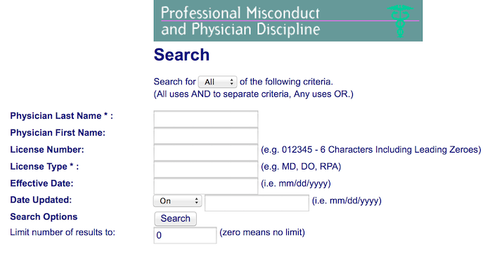
Thanks to New York State Public Health Law Section 230, all physicians who have had disciplinary action taken against them are placed on an “offender’s list” that is open to the public. Acts of medical misconduct may range from negligence in care to sexual abuse to grand larceny. Unfortunately, this list is not very accessible on NYS Department of Health’s website.
With the open data movement putting the power of information directly into the people’s hands (check out IQuantNY’s Tumblr for more fun), my collaborator Frank and I decided it was time to join the fray and tell the data-driven story of doctors behaving badly.
Time-Series Plots
Loading Data
You can find the open dataset on Professional Medical Conduct Board Actions on health.data.ny.gov.
Pre-Processing and Feature Selection
Effective.Date is a feature in the dataset that denotes the date on which the board action against the physician took effect. Since disciplinary actions must be authorized, the frequency of this variable in the dataset can be used to determine the number of physicians disciplined on a daily, monthly, and yearly interval. To make use of this variable, we convert it to the
date class.
Static Visualization
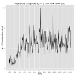
Our first set of visualizations will simply track the number of physcians disciplined by the New York State Department of Health from 1990-2013.
Interactive Visualization
I really wanted to practice making interactive charts with the
rCharts library. rCharts supports multiple javascript charting libraries and allows one to build beautiful graphs all within R - no javascript knowledge required (although highly recommended if one wants better customization). The code below uses morris.js to display the same graph above with the exception of being able to see the frequency of disciplinary actions at each month upon hover.
<link rel=’stylesheet’ href=http://cdn.oesmith.co.uk/morris-0.4.2.min.css>
<script type=’text/javascript’ src=http://ajax.googleapis.com/ajax/libs/jquery/1.9.0/jquery.min.js></script>
<script type=’text/javascript’ src=http://cdnjs.cloudflare.com/ajax/libs/raphael/2.1.0/raphael-min.js></script>
<script type=’text/javascript’ src=http://cdn.oesmith.co.uk/morris-0.4.2.min.js></script>